TestGorilla Rebrand: From Borrowed to Bold
When I joined TestGorilla, the company was scaling quickly and operating with a bold mission: to help one billion people land their dream job. The product was strong and the culture was ambitious, but the brand still reflected its early-stage beginnings. This project became about building a distinctive identity system capable of carrying serious ambition at scale.
TestGorilla was not lacking momentum. The team was global, fully remote, energetic, and performance-driven. There was clarity around the product and confidence in the roadmap. The mission itself immediately raised the stakes. When you are aiming to impact one billion careers, branding is no longer a layer of polish. It becomes part of the company’s infrastructure. It shapes perception, trust, and differentiation in a highly competitive space.
The challenge was not growth. The challenge was alignment. The brand had not yet caught up with the company.
The early brand: inspired but not distinctive
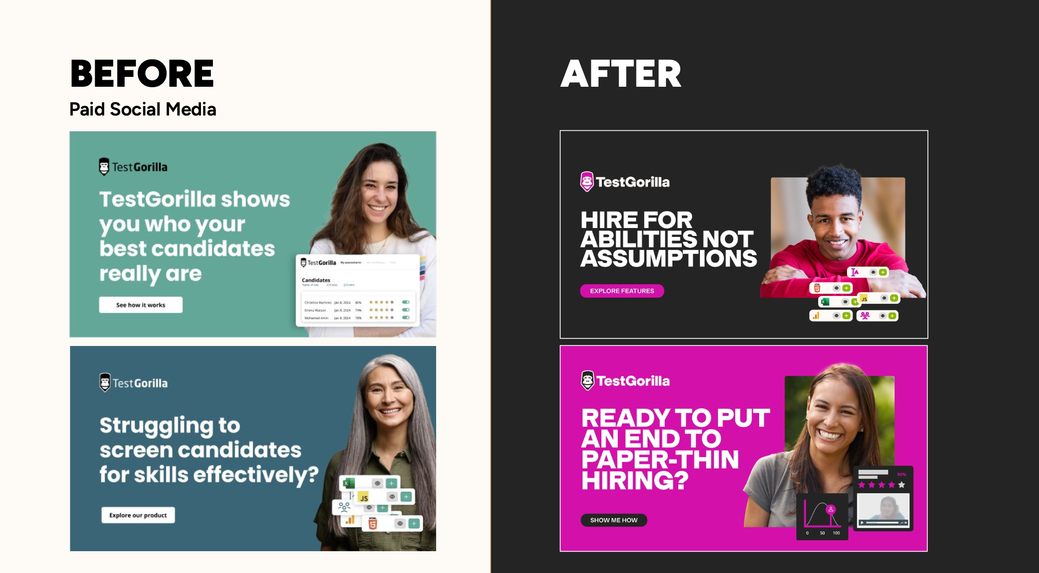
The original identity had been created quickly by the founder in the early days, built pragmatically and heavily inspired by N26, the German bank. The colour scheme and visual direction followed a similar aesthetic language. For a startup moving fast, this approach is understandable. It allows speed and clarity at the beginning.
However, as TestGorilla gained funding and visibility, it became increasingly clear that inspiration was turning into limitation. The brand functioned, but it did not stand apart. It felt borrowed rather than owned.
In a category like HR tech, where many companies already look similar, lack of distinction becomes a strategic risk. Blending in weakens memorability, and memorability drives trust and adoption.
The company had evolved. The brand had not.
In HR tech, perception defines credibility
TestGorilla operates in hiring and assessment, a space deeply connected to people’s careers, fairness, bias, and high-stakes decision-making. Trust is not optional in this category; it is fundamental.
At the same time, the HR tech landscape is dominated by cautious visual systems. Corporate blue is everywhere. Minimalist layouts, predictable typography, and safe messaging patterns define the majority of the market.
Internally, however, TestGorilla was anything but cautious. The culture was bold, energetic, slightly rebellious, and unapologetically global. “Be Bold” was the first company value employees encountered. There was ambition and a sense of forward movement that the existing identity did not communicate.
The brand needed to reflect the truth of the organisation. Not a diluted version of it.
The naming debate: protecting emotional equity
One of the longest discussions during the rebrand was whether the name itself should change.
TestGorilla is distinctive and memorable, sitting alongside unconventional SaaS names like SurveyMonkey or Mailchimp. However, in certain HR contexts and cultural environments, the word “gorilla” can raise sensitivities. The conversation was strategic, not superficial.
My recommendation was to keep the name.
Beyond potential criticism, the name had become deeply embedded within the company culture. Employees rallied around the gorilla as a symbol. It appeared in employer branding, internal rituals, and community initiatives. Employees reaching their one-year milestone even had a gorilla sponsored in their name as part of a company tradition.
That is not decorative branding. That is emotional equity.
Removing the name would have stripped away something authentic. Instead of eliminating risk by erasing identity, we chose to strengthen the brand system so it could carry the name with maturity and confidence.
The goal was not to play safe. It was to build strength.
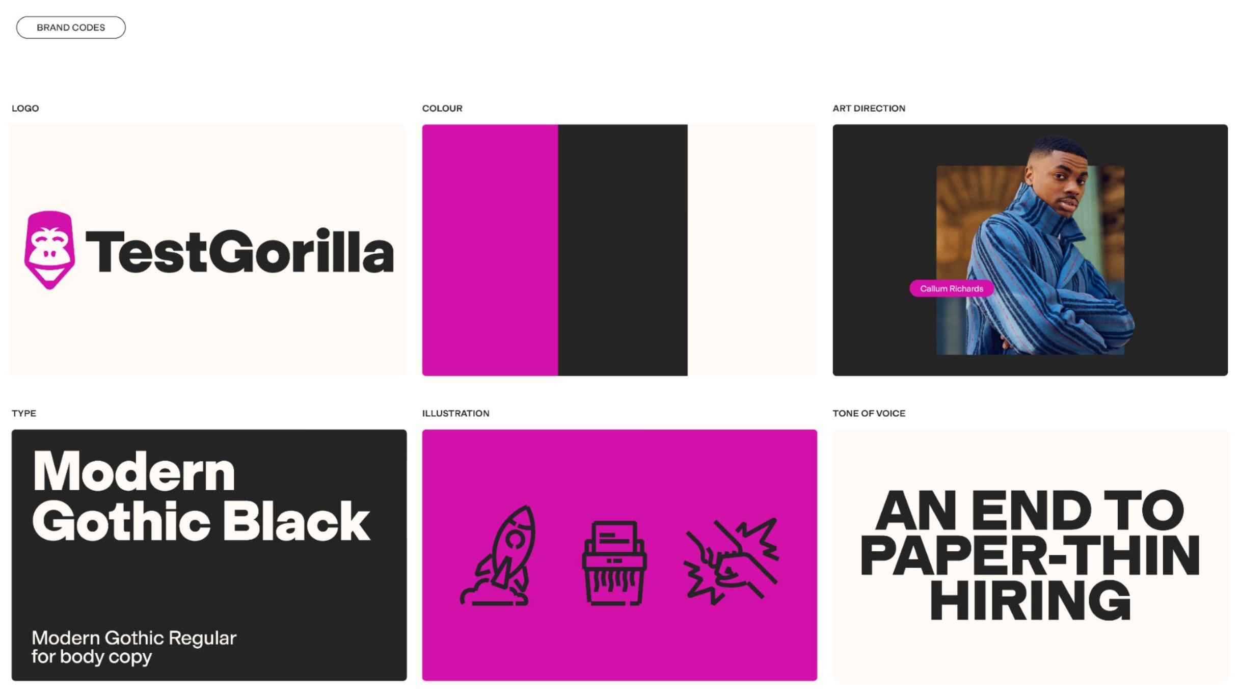
The breakthrough moment: owning colour
Every rebrand has a defining decision that anchors the system. For TestGorilla, that decision was colour.
Colour is one of the most powerful drivers of brand recognition. In HR tech, corporate blue dominates because it signals safety and familiarity. Yet safety was not the defining quality of TestGorilla’s culture. Boldness was.
The brand needed to embody that value visually.
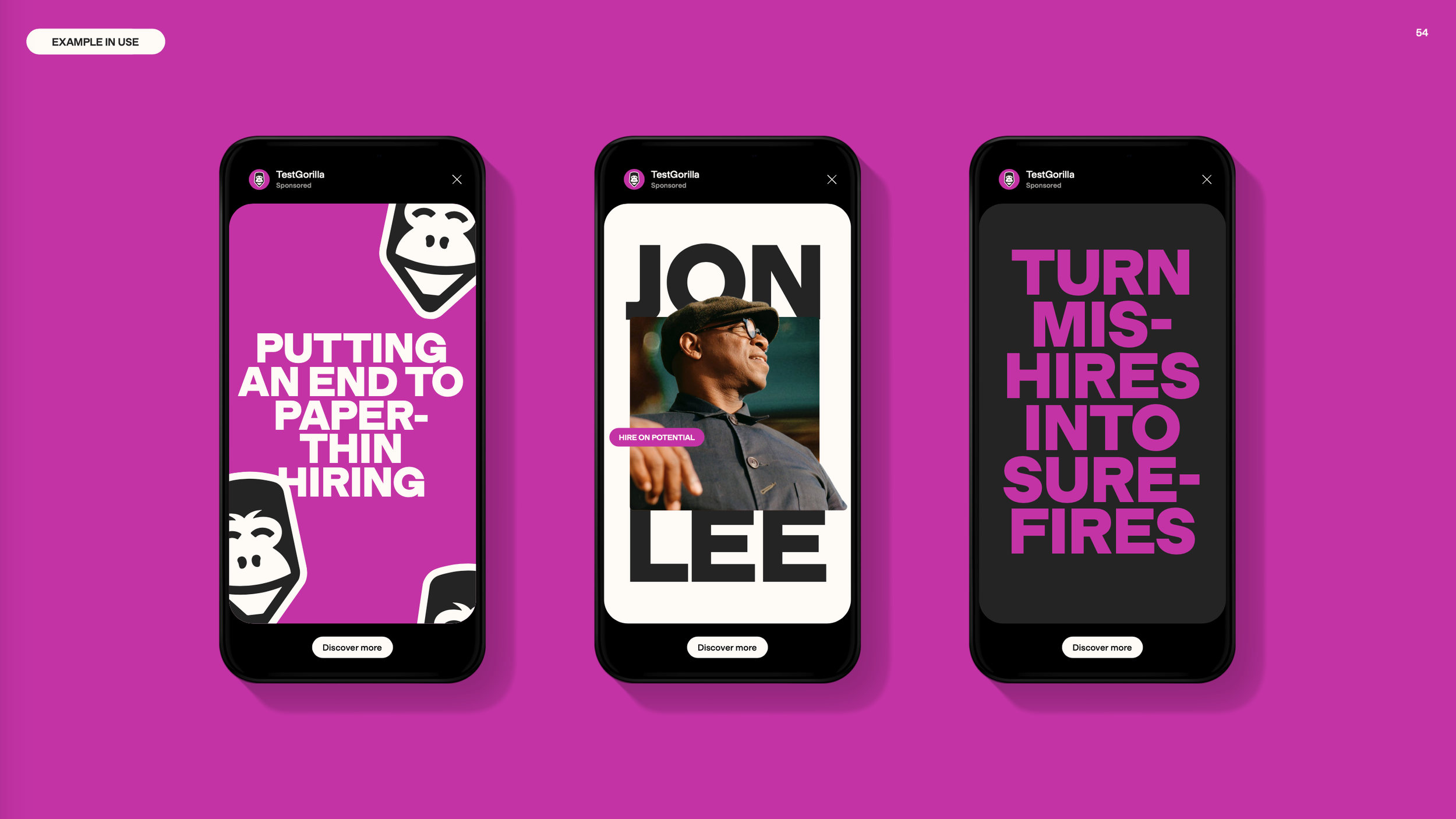
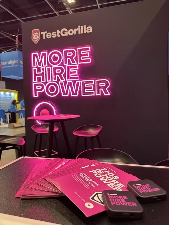
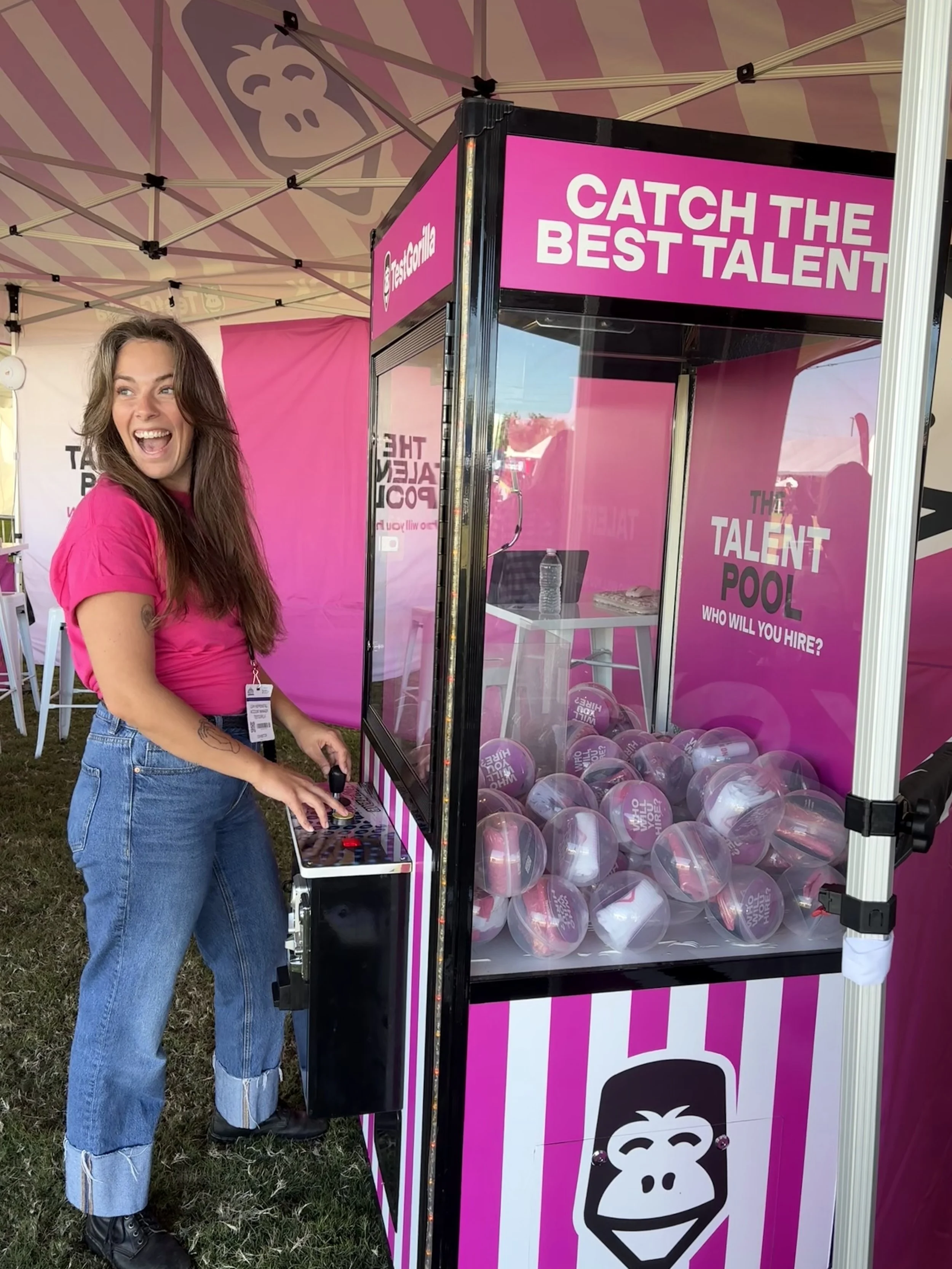
We made the deliberate decision to own a bright, unapologetic pink. It was punchy, confident, and impossible to ignore within the category. More importantly, it aligned with the internal culture. The CEO embraced it immediately, and the team adopted it naturally.
The shift felt less like a radical experiment and more like a brand finally expressing what the company already was.
Once colour was defined, the rest of the system found its direction.
Building a brand system with conviction
From that anchor, the identity expanded into a complete brand world.
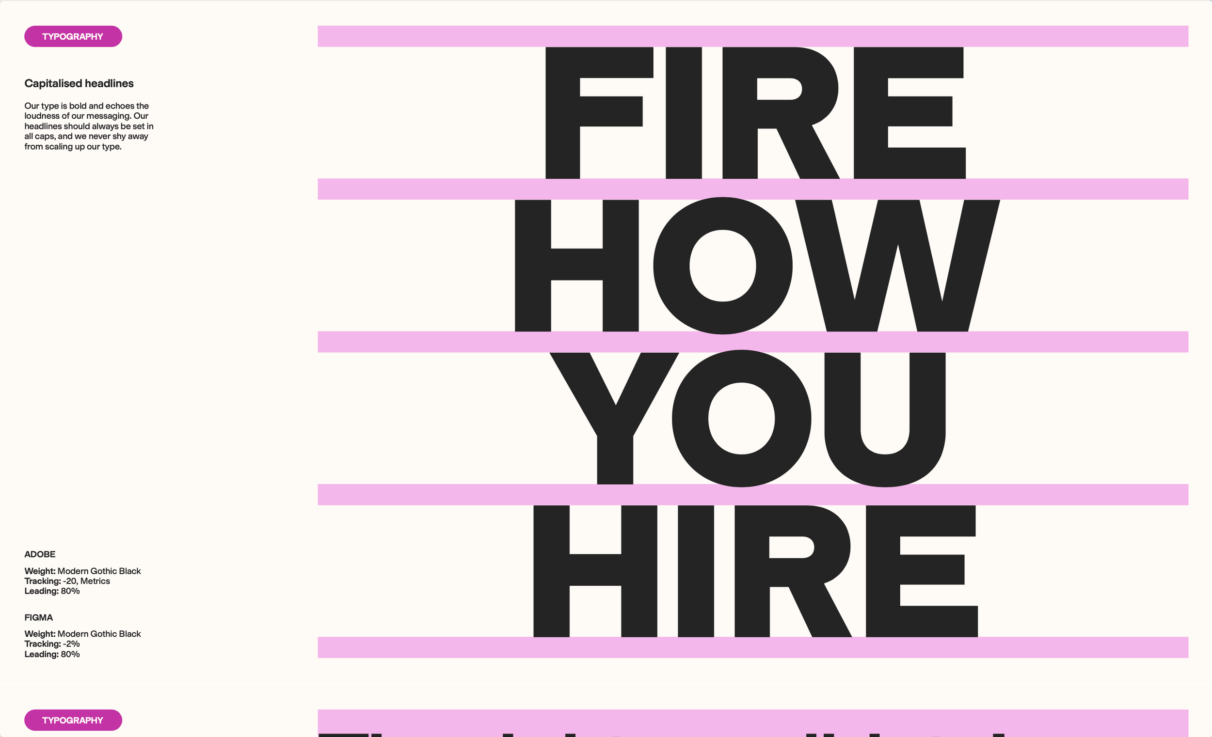
Typography became stronger and more assertive. Copy adopted a sharper, more direct tone. Illustration embraced a slightly rougher quality to retain humanity and avoid sterile corporate polish. The palette expanded into darker tones and creams to support scalability while keeping pink as the unmistakable hero.
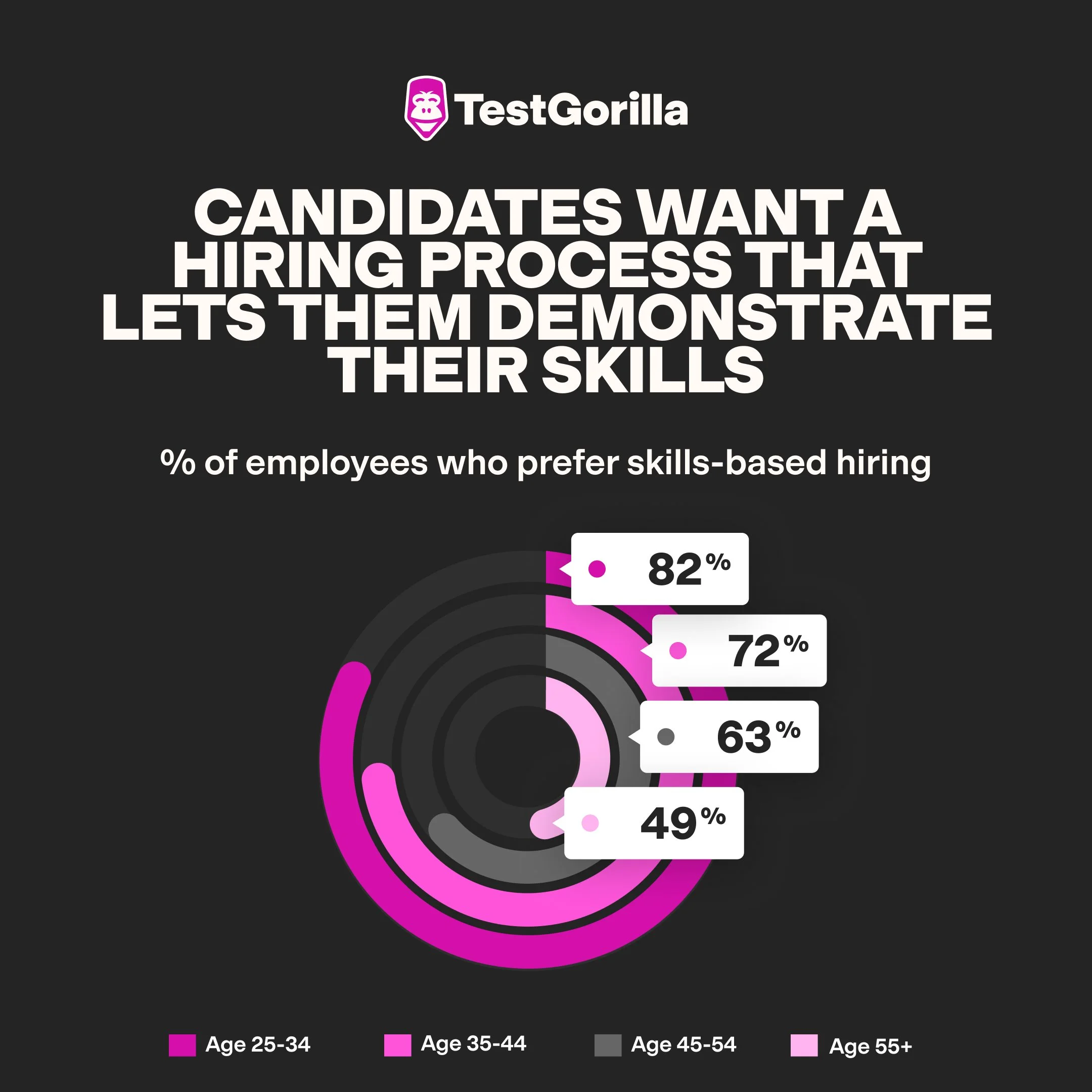
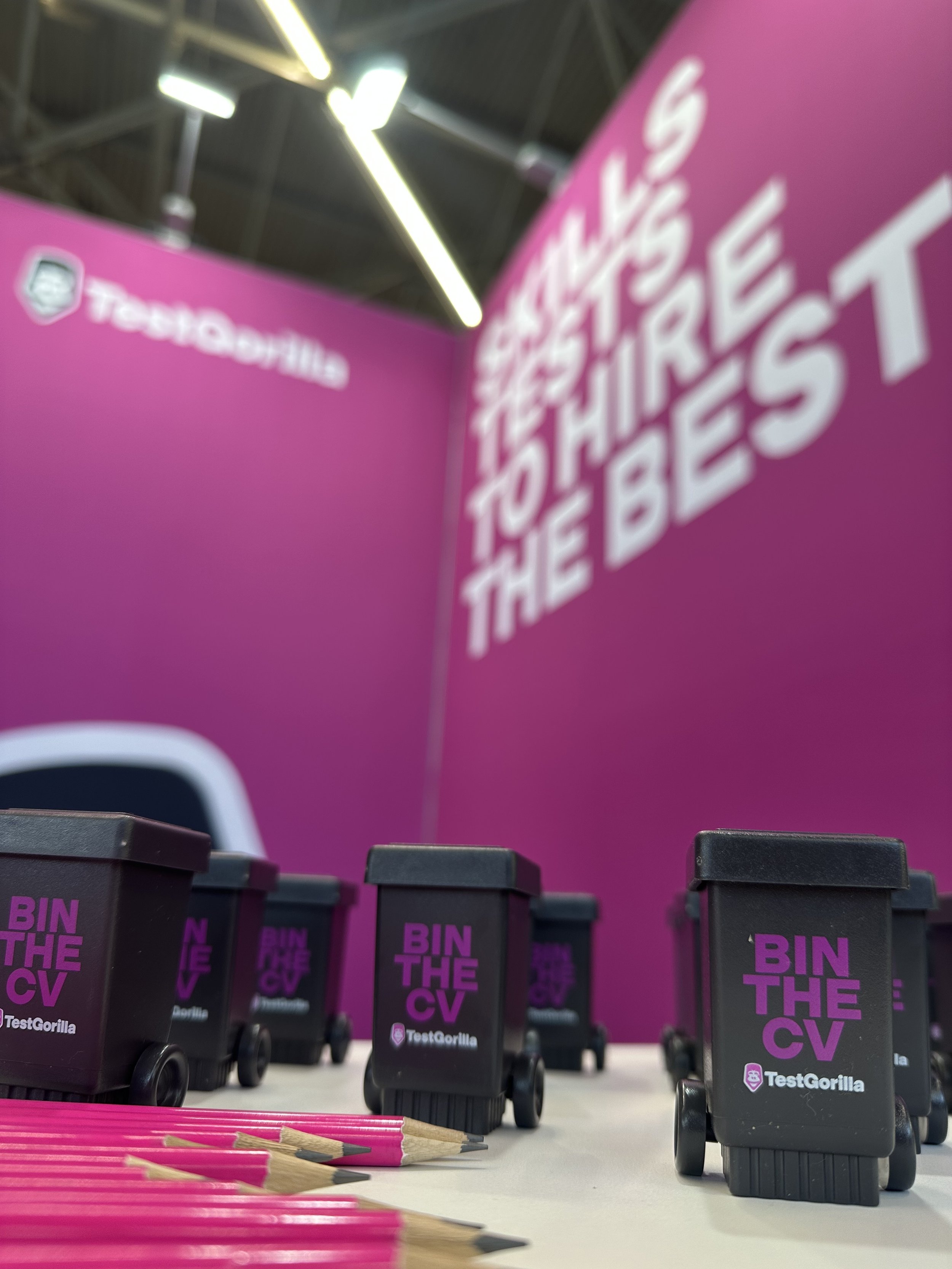
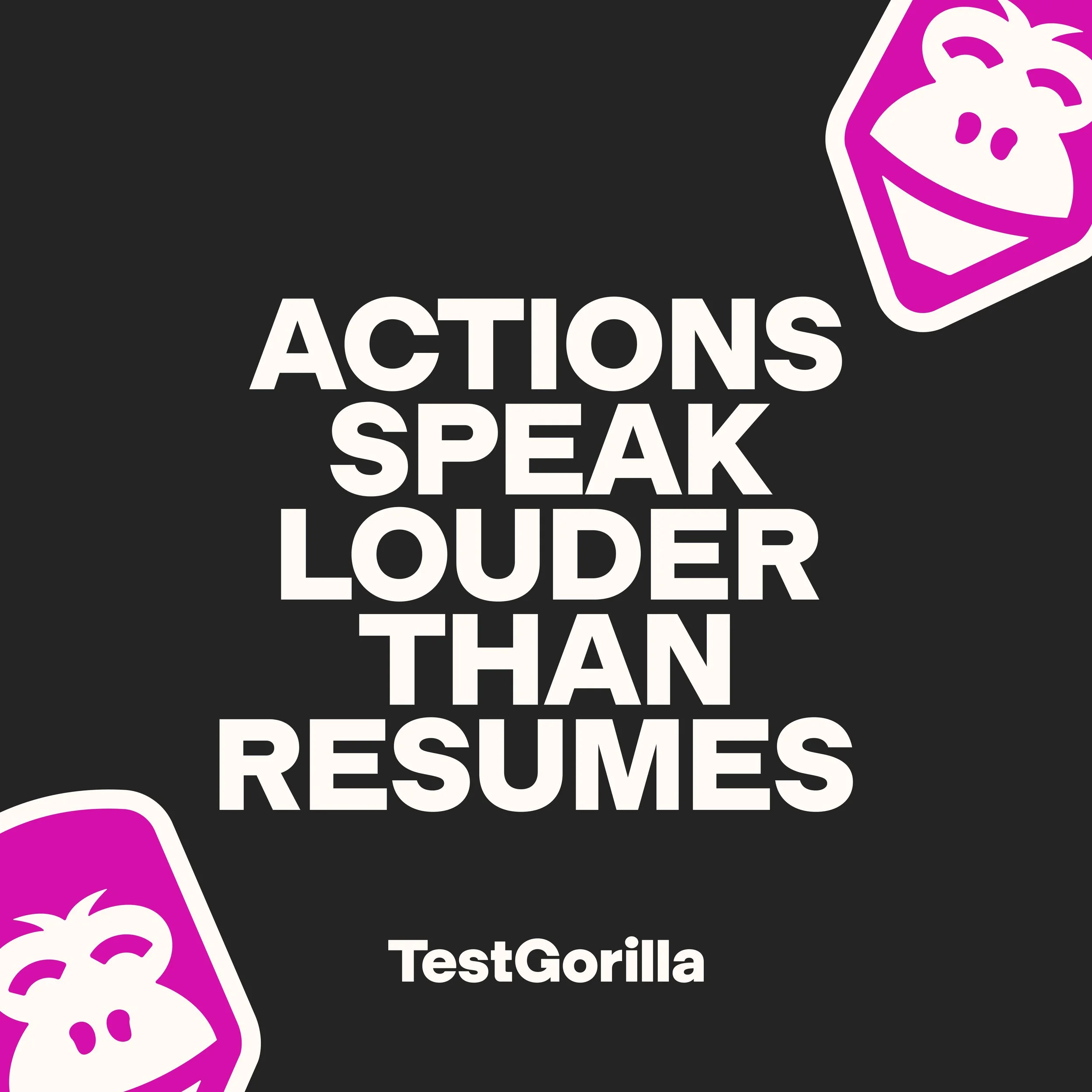
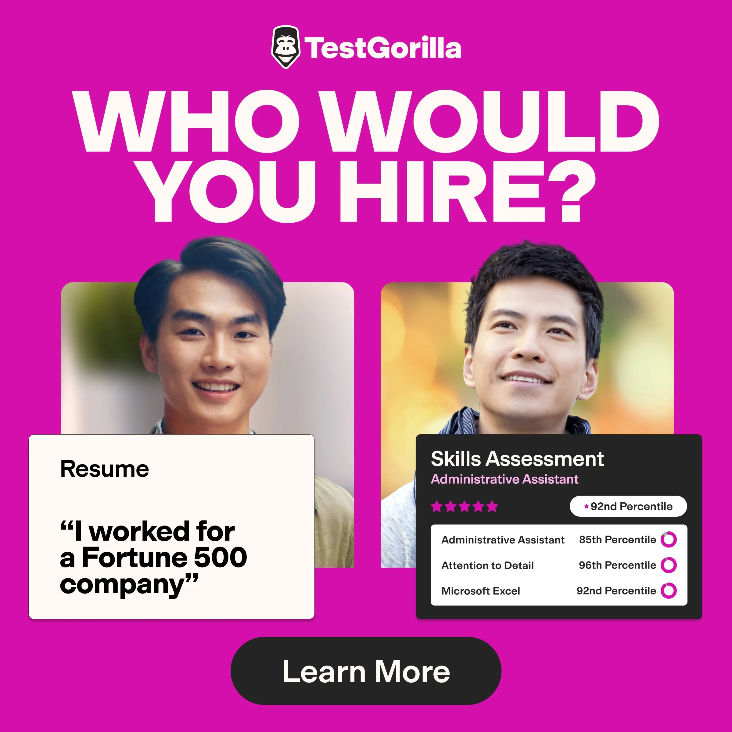
Strategically, we sharpened the brand belief. TestGorilla stands for skills over CVs. It challenges outdated hiring practices and bias embedded in traditional resumes. Framing resumes as the villain was not a gimmick; it was a clear articulation of the product’s purpose.
The brand system was not built around aesthetics alone. It was built around conviction.
Implementation at scale
Designing the system was only half the work. Implementation required discipline, planning, and endurance.
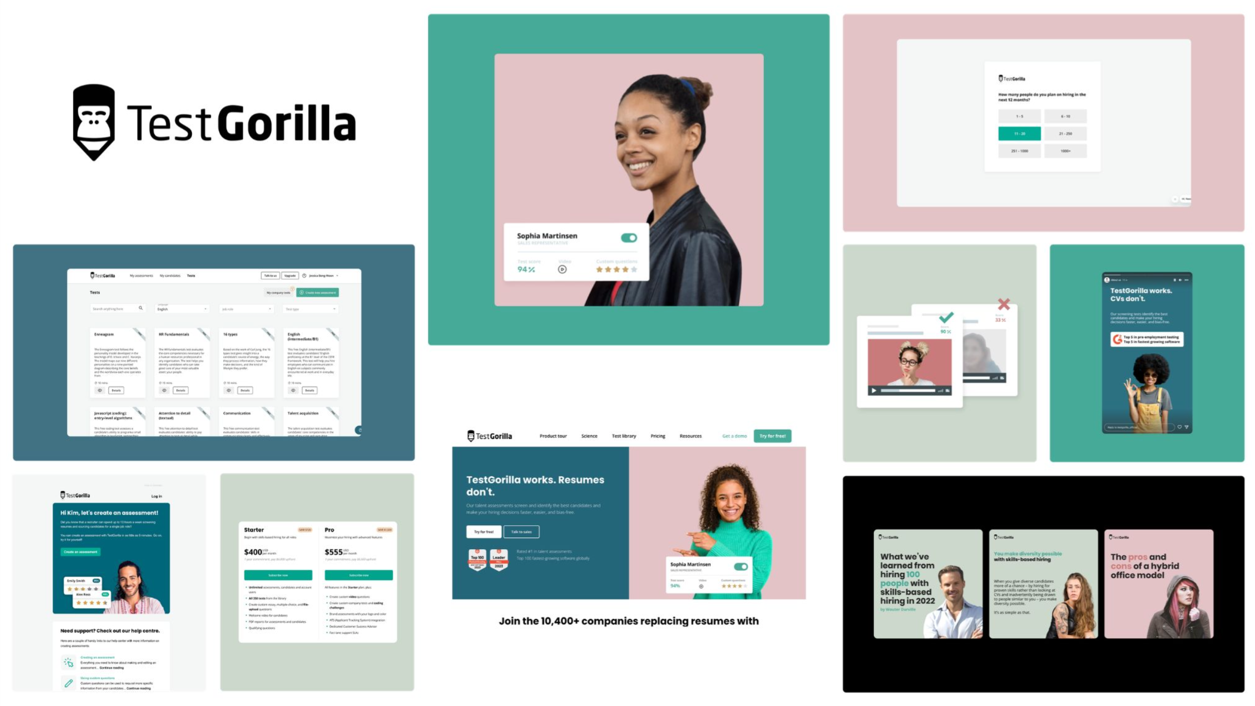
Once the direction was approved, I led the rollout across the organisation. Every asset was mapped and categorised. Website pages, sales materials, templates, automated email journeys, contracts, email signatures, internal communications, employer branding assets — everything needed to reflect the new identity.
We estimated over 3,000 assets required updating, excluding product UI. The timeline was three months.
The website redesign became the largest component of the rollout. We partnered with an agency to accelerate production while I led the project end-to-end, ensuring that the new design system was integrated properly into the CMS. The objective was not just a launch moment but long-term scalability.
Beyond execution, internal adoption was critical. I took on the role of brand guardian, communicating the changes, guiding teams through the new system, and ensuring the brand was understood, not just applied.
We met the deadline.
Personally, this period coincided with relocating from the UK to Dubai while pregnant. It was an intense chapter, but it reinforced a central truth of brand leadership: clarity and discipline matter as much as creativity.
Scaling production with AI
The new identity was intentionally people-centric, which created another operational challenge. Purchasing large volumes of stock photography at scale would have been costly and inefficient.
We used AI pragmatically to support production. Midjourney helped generate aligned model imagery, and Photoshop automation workflows streamlined editing and background treatments. The goal was not experimentation for novelty’s sake, but efficiency and consistency at scale.
The tools supported the system. They did not define it..What the rebrand really achieved
The TestGorilla rebrand wasn’t just a new look. It was the company stepping into itself.
It became more recognisable in a crowded category. More ownable. More confident. More aligned with its internal culture and external ambition. And it finally felt like a brand that could support a mission as bold as reaching one billion people.
What the rebrand really achieved
The TestGorilla rebrand marked a moment of maturity.
The company stopped feeling inspired by others and started feeling unapologetically itself. It became more recognisable, more distinctive, and more aligned with its internal culture. Most importantly, it gained a brand system capable of supporting an ambitious global mission.
It did not become more corporate.
It became more honest.

What I learned
This project reinforced that rebrands are rarely about surface-level design changes. They are about alignment, conviction, and disciplined execution.
Strong brands are not built by imitating category norms. They are built by clarifying what you stand for and expressing it consistently.
TestGorilla did not need to look safer. It needed to look like itself. And that is what we built.